There’s always something about iOS that brings you back to the beginning, to the original. You’ve used so many apps, but in the end you go back to the ones you activated, and the same goes for wallpapers.
From iPhone OS to iOS 13, I don’t know if you’ve ever looked at every single wallpaper in the settings, some have been preserved by Apple, some have been removed by Apple, but each one has the taste of the past and the feeling of the beginning.
iOS 13
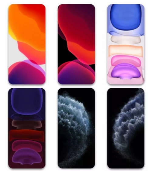
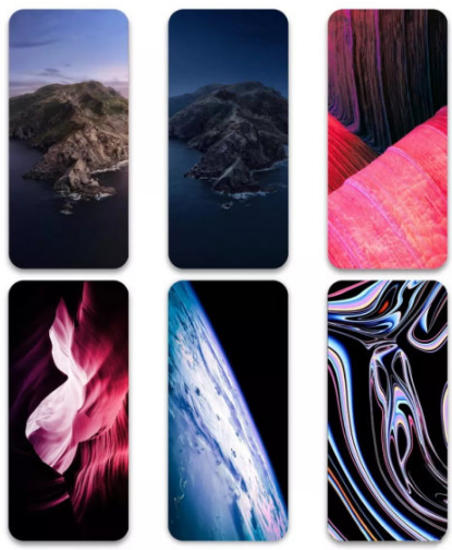
The default wallpapers for iOS 13 are both light and dark, thanks to the introduction of dark mode. This year’s Universal Wallpaper continues Apple’s abstract colour style of recent years. iPhone 11 and iPhone 11 Pro both have their own exclusive wallpapers. iPhone 11 has a similar abstract colour wallpaper to the Universal Wallpaper and has been adapted for the colourful iPhone 11 body. iPhone 11 Pro continues the plain black background of last year’s iPhone XS series. The iPhone 11 Pro has the same plain black background as last year’s iPhone XS series, which saves power and hides the fringes.
iOS 12
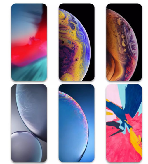
The wallpapers in iOS 12 are quite polarised, with the only generic wallpaper being the psychedelic default, and almost everything else being exclusive. Examples include the planet-like (actually paint) ‘hide the bangs’ wallpaper for the iPhone XS series, the rounded wallpaper for the iPhone XR and the ‘get creative’ wallpaper series for the new iPad.
iOS 11
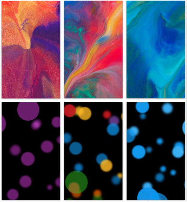
The wallpaper for iOS 11 actually comes in two parts, one exclusive to the iPhone X and one that is available with all updates to iOS 11. The public wallpapers probably don’t have the same tone as before. Instead of a single colour, they start to become bright and rich, giving them a magical feel. iPhone X has a very different kind of wallpaper in the live photo category, like a flowing sand painting.
iOS 10
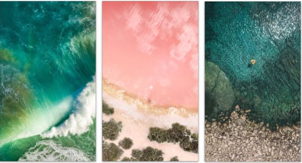
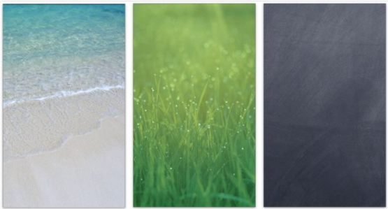
The iOS 10 update didn’t bring us too many wallpapers that were simple yet beautiful, with beaches and oceans looking down from the sky. Many people have gone on to try to take photos like this standing on the beach afterwards, and this time the wallpaper actually displays most perfectly on the iPad Pro, which is extremely flattering for its size.
iOS 9
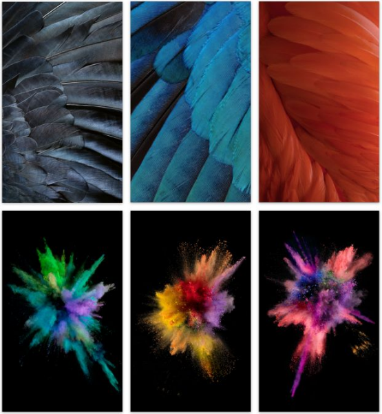
The iPad series received a major update in 2015, with the 12.9-inch iPad Pro coming to the forefront. At the same time, two more options were added to the wallpaper settings: ‘Still’ and ‘See-through’. Soft feathers, gorgeous waves and exploding powder are all subtly ‘luxurious’, and with the new perspective effects, the 3D effect is even more realistic.
iOS 8
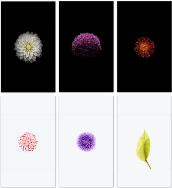
With the advent of iOS 8, the iPhone 6 Plus was launched. Users have a wider view and more room to manoeuvre. The wallpaper is also handled more delicately, with large black areas blending in with the black screen on the front for a blended effect. The unique exposure treatment makes the flowers even more delicate. You can actually make these wallpaper-quality photos, too, just by taking a picture of a flower and processing it.
iOS 7
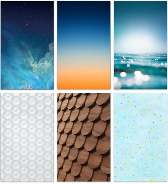
Remember how excited or overwhelmed you were when you first saw iOS 7? The new design led directly to a big shift in wallpapers, with the ‘cool’ style moving directly to a bright, but slightly hazy, look.
iOS 6
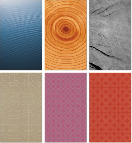
With the advent of the retina screen, the details in iOS got even better, with subtle icons and a slick Dock that was even more classic. iOS 6 was also the last generation of the ‘old’ system, and the built-in wallpaper changes started to move towards an artificial design style, with several textured background images, but unfortunately I didn’t think to change one to see the ‘old with the new’ feel at the time.
iOS 5
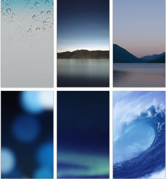
This year saw the release of the iPhone 4S, which continued to improve in performance without much change in appearance, and the overall UI remained anthropomorphic. In this update, Apple removed some of the previous wallpapers and reintroduced a few new ones, with ocean and lake becoming the mainstream, no eye-catching colours, just simple rhythm.

iOS 4
The emergence of the pure white iPhone 4 shocked the entire mobile world with a better system and a more beautiful design, all of which were shown off immensely in Steve Jobs’ presentation. I don’t know if you remember a white phone and a dewy grey wallpaper that was a touching sight. In the turnover, you can also see Apple’s aesthetic discovering a change, slowly fading from the more vibrant shades to a cleaner, more minimalist experience.
iOS 3 (iPhone OS 3)
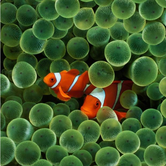
When the first iPhone was released, the phone’s operating system was not yet called iOS, but iPhone OS. The first few generations of the system also did not support changing the desktop wallpaper, and users could only choose from different styles of lock screen wallpaper. The most impressive of these wallpapers was this coral fish wallpaper, which appeared as the default wallpaper for the iPhone in various iPhone ads.
macOS Catalina
Unlike the abstract style of iOS, macOS Catalina’s default wallpaper has always been shot in the field. macOS Catalina’s default wallpaper is Catalina Island in the Pacific Ocean, with the contrast between warm and cold on the left and right of the image making it even more eye-catching. In addition, Pro Display XDR, which was released at the same time as macOS Catalina, also has a unique wallpaper to show off its extremely high dynamic range.
macOS Mojavemac
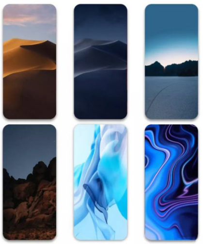
The best-known wallpaper in macOS Mojave is the sand dunes that change over time. But macOS Mojave also has a number of great-looking wallpapers built into it, such as the various wonders of the Mojave desert. As well as generic wallpapers, the 2018 Macbook Air and MacBook Pro also have their own exclusive wallpapers, with a more abstract design that leans towards iOS.
